Custom Figure Layouts
In addition to the composite and multi-panel figures described earlier, some familiarity with Python and matplotlib enables offers great flexibility. For those unfamiliar, we have many examples in the documentation which you can view, copy, or modify to suit your needs.
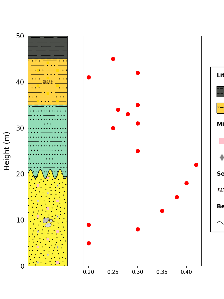
For example, we can create a custom subplot arrangement, and tell stratapy where to plot the log within this figure.
Note that both the figure and axes variables need to be passed to the .plot() method; legend for the log is drawn with respect to the figure.
import matplotlib.pyplot as plt
fig, ax = plt.subplots(nrows=1, ncols=2, figsize=(6,8), gridspec_kw={'width_ratios': [1, 3]}, sharey=True)
log = sp.load('examples.geology_log.csv')
log.plot(fig=fig, ax=ax[0], display_mode='log', legend_columns=2, feature_size=2)

# Plot some random data on the second axis
ax[1].scatter(
    [0.2, 0.3, 0.2, 0.35, 0.38, 0.4, 0.42, 0.3, 0.25, 0.3, 0.28, 0.26, 0.3, 0.2, 0.3, 0.25],
    [5, 8, 9, 12, 15, 18, 22, 25, 30, 31, 33, 34, 35, 41, 42, 45],
    color='red',
    s=50,
    marker='o',
)
Note
See a more complex example in the Gallery, or access it online through Google Colab.